 Building a high-performance creative team with staying power in the corporate setting is a formidable challenge. Rome wasn’t built in a day and neither was the development of the new package design system for the Publix brand private label and the in-house creative team that moved this initiative forward.
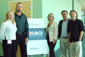
Creative professionals who came together in October 2007 for the InSource Fall Event called “White Noise – How A Predominantly White Label Created So Much Noise For Publix And Its In-House Team” had the extraordinary opportunity to learn firsthand how this work has generated success for Publix. Hosted at the Publix Super Markets Corporate Office in Lakeland, Florida, this half-day event focused on major insights of this work from an in-house perspective, with an emphasis on various aspects that are relevant to other corporate creative teams.
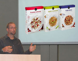
 Tim Cox, Creative Services Director for Publix who works closely with a team of more than 50 creative professionals, presented an in-depth case study of the Publix private label redesign. Within the context of this creative team’s role in providing focus for the visual and written expression of the Publix brand, Tim described the evolution of the creative process; the need to establish clear objectives; the importance of research – including the use of focus groups and customer intercepts at Publix stores – in building a strong case for the redesign recommendation; and the implementation of decisions made relating to this initiative.
With respect to the creative approach, Tim used the words of Jazz legend Charles Mingus to communicate the mindset of their work: “Making the simple complicated is commonplace; making the complicated simple, awesomely simple, that’s creativity.”
“To be simple and effective is hard work,” said Tim, noting that in today’s world with so many gadgets and bells and whistles, it takes restraint to be simple and resist the impulse to decorate one’s work. “Our approach was to elevate the focus of our Publix branded products from ‘price’ to ‘price + quality = smart value.’”
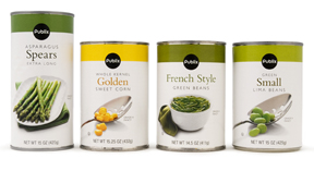
Key elements of the redesign were the consistent use of a color band and Publix brand mark, unique imagery, typography/proprietary usage and decisions about color, calm space and architecture. These components also became tools for assessing effectiveness in achieving the stated objectives – namely, to sell more products by increasing customer awareness and improving value perception and to align with Publix positioning – and for making enhancements later on.
Once the corporate go-ahead to proceed with the redesign was given in 2002, the rollout began in 2003. Tim and his team were given three years to complete a full-blown system redesign, with the herculean task of making system conversions for all product SKUs (SKUs or stock keeping units are identifiers for billable entities used in product inventory systems). Achieving this goal required assistance from external resources for various production aspects of the project.
 The results: Publix discovered how to achieve design simplicity in the marketplace and to stand out on the shelf. This has had a favorable impact on the sales of Publix private label products that endures over time. Building on the substantial equity of the brand and a track record of positive product experiences among Publix customers, customers now have an increased awareness of Publix products and are making purchasing decisions accordingly. Customer feedback comments are carefully tracked and reveal candid opinions about the impact of the redesign. Examples: “I found myself drawn to the delightfully new and innovative packaging” and “It is clean, fresh looking and simple; my pantry is looking really cool!!”
Tim shared ten specific “lessons learned” that have been instrumental in the continued growth and development of the Publix creative team:
• Hire people who are (or have the potential to become) better than you.
• Treat individuals on your creative team really well; people are your number-one resource.
• Define objectives up front and obtain agreement to objectives from decision makers before presenting concepts.
• Request a second opinion – from someone you can trust.
• Be disciplined, and be a designer, not a decorator.
• Create appreciation for design within the company.
• Convert any skeptics by meeting their objectives and achieving results.
• Build relationships throughout the organization.
• Demonstrate “good creative” by doing it, not just talking about it.
• Achieve balance (as defined by Gordon MacKenzie in the book, Orbiting the Giant Hairball—a “must read” for all in-house creatives).
Tim’s prepared remarks generated a lively question-and-answer roundtable discussion among attendees, covering such topics as how in-house creative teams can build a compelling case based on objective data for further development of creative ideas; the strategic use of external resources to handle nonstrategic aspects of a project; ways to attract and retain talent; developing a clear vision for the continued growth of creative teams within their companies; gaining support and increasing credibility by building effective relationships with internal clients; and implementing work space enhancements that make in-house creative services a distinctive destination. Participants shared candid observations about the need to learn from one another on ways to confront ongoing daily challenges as in-house creative professionals, as well as their ideas on how the work of in-house creative teams can fit in yet stand out.
 All attendees received a sampling of Publix products that feature the redesign, including Publix “UN-BEE-LIEVABLY YUMMY” Salted Honey-Roasted Peanuts (with bee graphic), Publix California MiniSnack Raisins (with raisin-inspired happy face graphic) and Publix Aluminum Foil (with graphic of animals made of foil). Visit any of the more than 950 Publix Super Markets located in five US southern states, read archived articles in The New York Times and various design industry publications and/or visit www.publix.com to see samples of this design work. The Publix creative team was named “HOW’s 2005 In-House Group of the Year” along with other accolades for their work on the Publix private label redesign.
Special thanks to Getty Images and Aquent for providing sponsorship support for this InSource event.